Regular

Bold

Italic


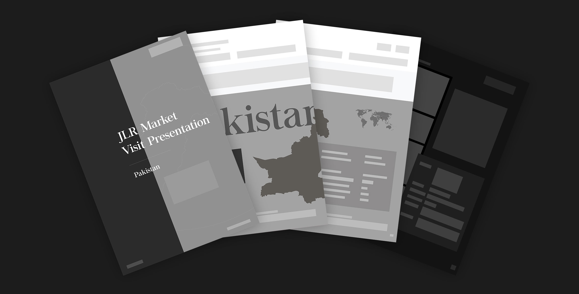
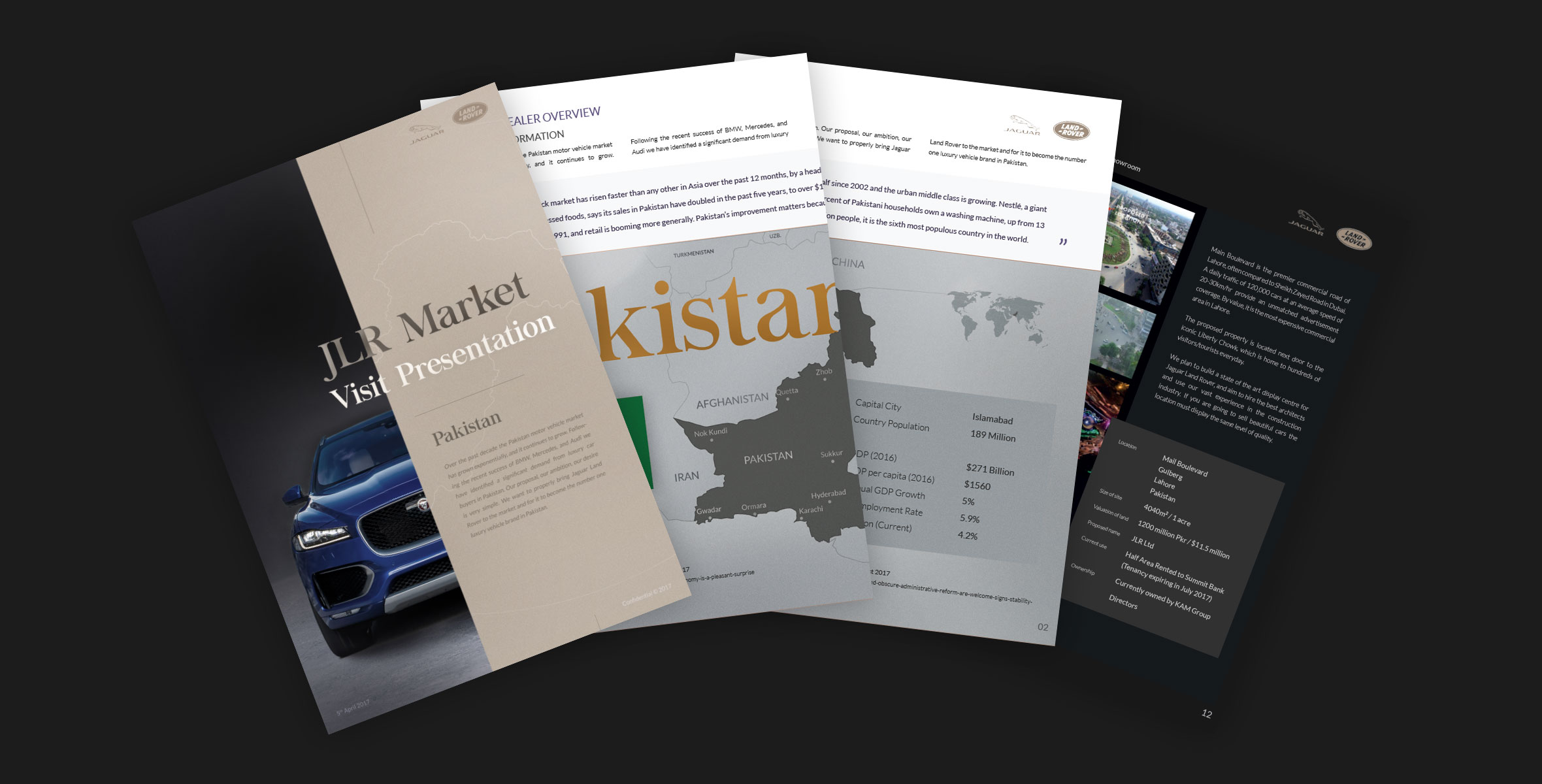
We designed a high-end brochure for a group of talented individuals that were pitching to bring Jaguar Land Rover to Pakistan.
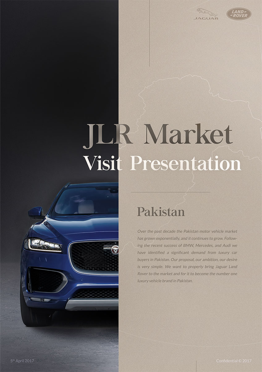
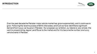
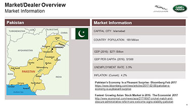
The Pakistan luxury vehicle market has grown exponentially over the past decade and there aren’t any signs of it stopping anytime soon. JLR Pakistan wanted to pitch this opportunity to Jaguar Land Rover as they felt they were missing out especially due to the recent successes of BMW, Mercedes and Audi. The team already had a strong presence and a wealth of experience in the wider market and had been refining their proposal over the years. Seeing JLR’s competitors move decisively into the rapidly emerging market, they felt it was time for JLR to also introduce their luxury brand and international presence into Pakistan.
2017
Since JLR Pakistan were pitching to Jaguar Land Rover, we felt the most important thing we could do was to get a feel for the luxury brand, their values and the colours they gravitated towards. Because the team had already done their research into the market and nailed down their business proposition, we mainly focused on finding a visual identity for the proposition as well as a creative direction for the project.
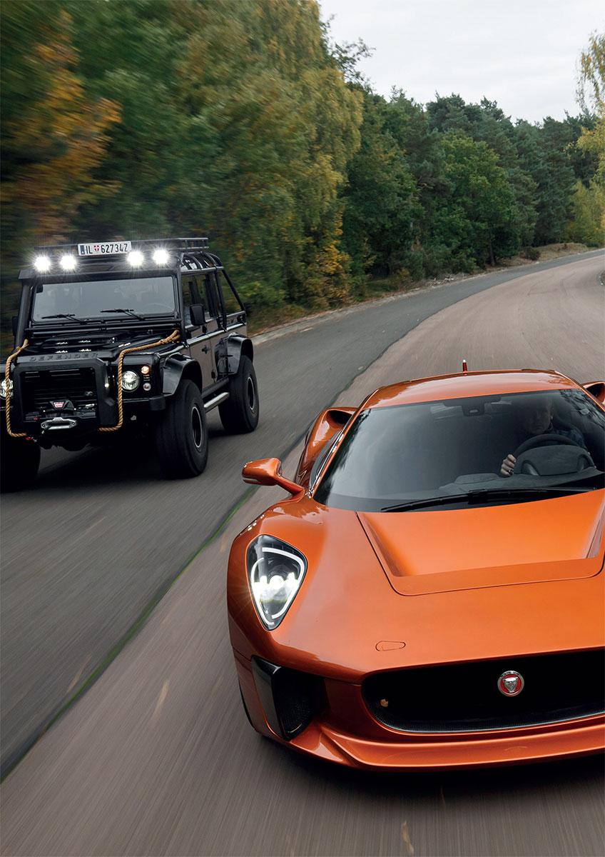
We did this by looking at a multitude of the brand touchpoints that potential customers have with Jaguar Land Rover across a variety of mediums, including digital experiences, marketing brochures as well as the physical cars themselves.
The brochure would be the lingering reminder to Jaguar Land Rover of the team’s business opportunity after the pitch itself, so getting the layout and the typefaces working correctly was of utmost importance. We arrived on a refined serif typeface, Chapaza, for the main headings and points of interest, to bring through that element of luxury within the business proposition, and paired it with a sans-serif typeface, Lato, for the main body of the content. This gave us a good balance between making the large amount of information, that made up the majority of the brochure, very readable, whilst still linking the brand with that of Jaguar Land Rover.
We arrived on a generally neutral colour scheme for the brochure to reflect the vision for the business. There was a lovely gold we’d noticed that was quite prevalent in the interiors of the cars, and we decided that this shade would work wonderfully if used sparingly throughout the brochure to draw the readers’ eyes to the areas we wished to highlight.
The main priorities for the brochure was to pass on all the detailed information about the business opportunity to readers in a way that invited them to want to know more. We started by immersing ourselves within the intricacies of the provided content so that we would have a solid foundation from which to progress, so we could produce a truly representative end-product.
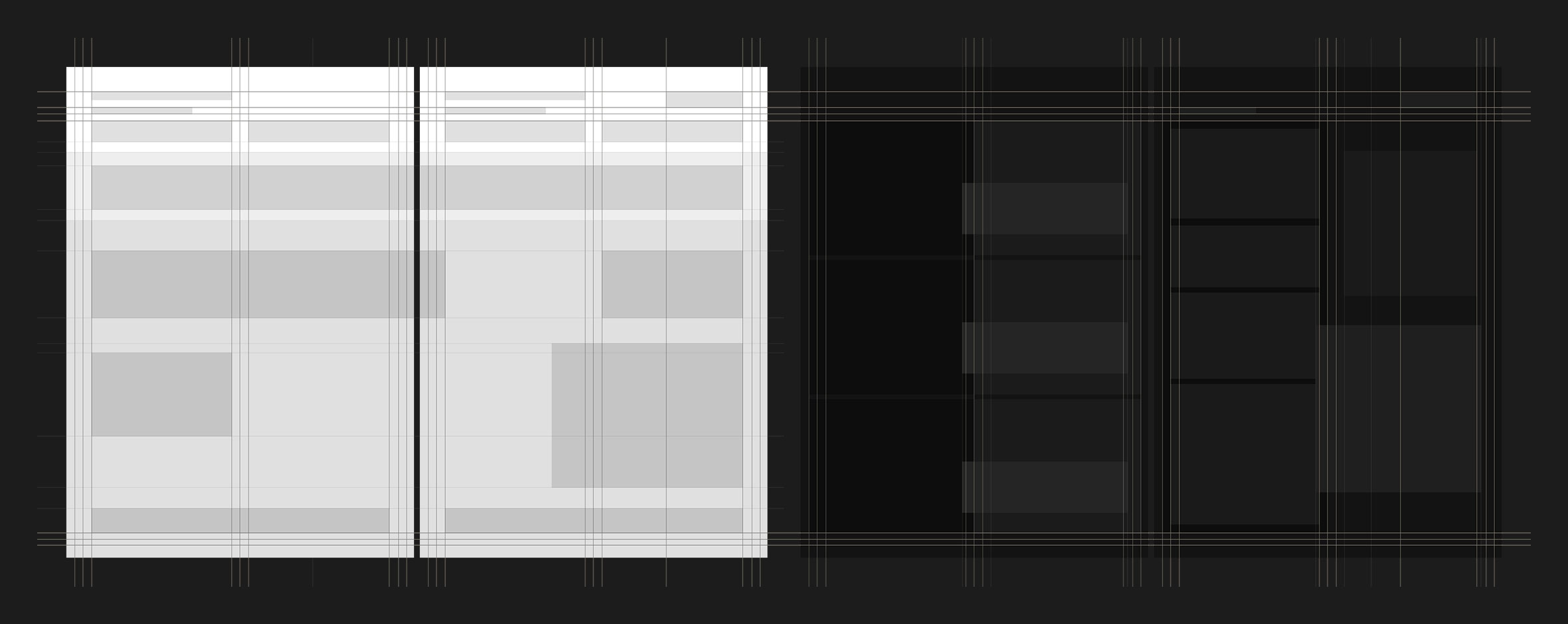
Surprisingly for a project like this, we felt that the best way to convey all our ideas on the relationships between the typefaces and the content spacings for the brochure would be to start by designing the front cover of the brochure. We had quite a strong idea for the route we wanted to go down, and it didn’t take much tweaking to agree on a single cohesive layout that we wanted to form the basis for the entire document. The final guidelines we developed allowed enough flexibility for each page to best represent their own content without compromising on the integrity of the document as a single entity.
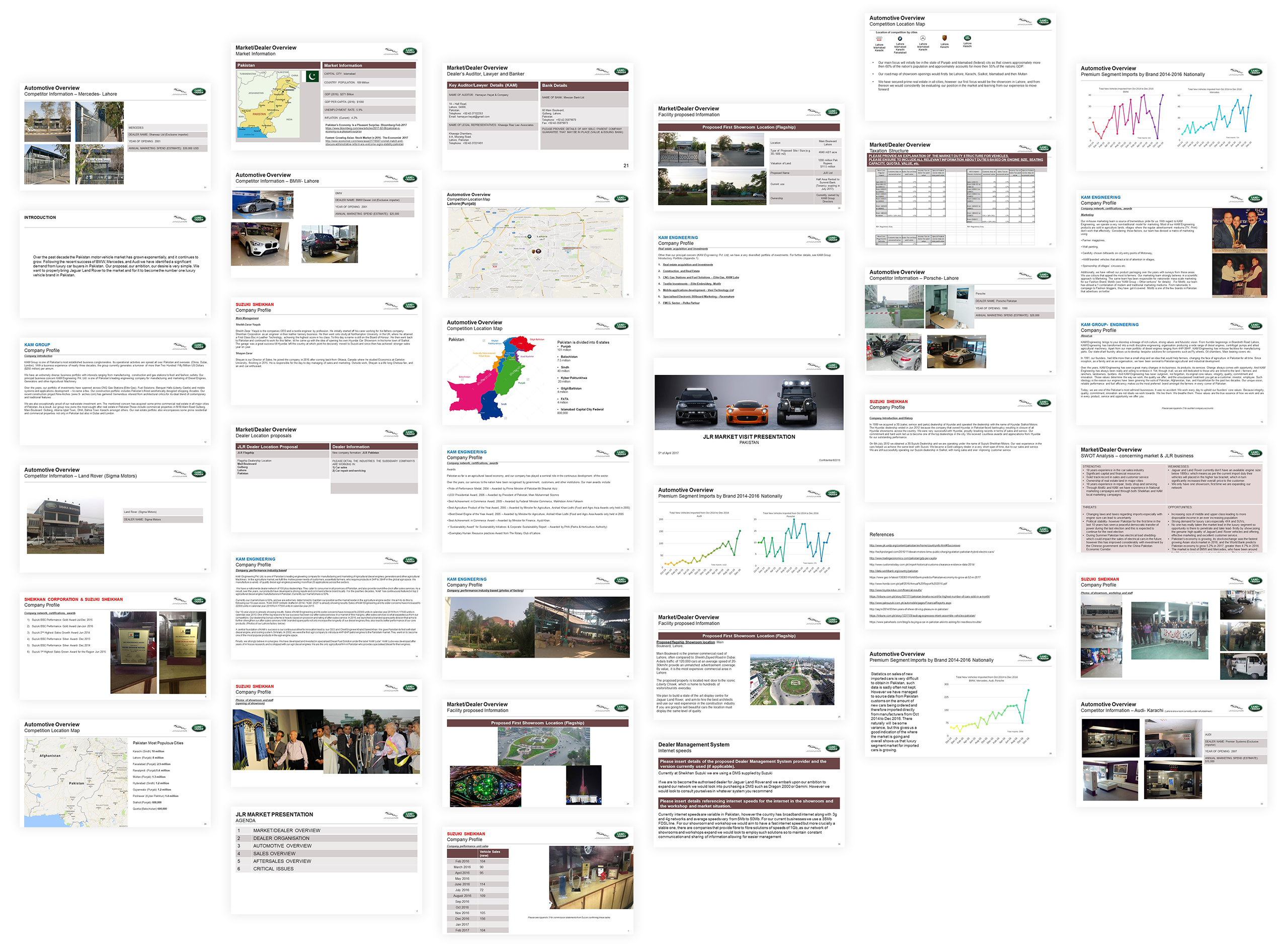
The best way to pitch the opportunity was to build a clear narrative that told the story of the project from beginning to end. We did this by going through the content provided and laid out areas that we felt were related and those that worked well together onto general page layouts.
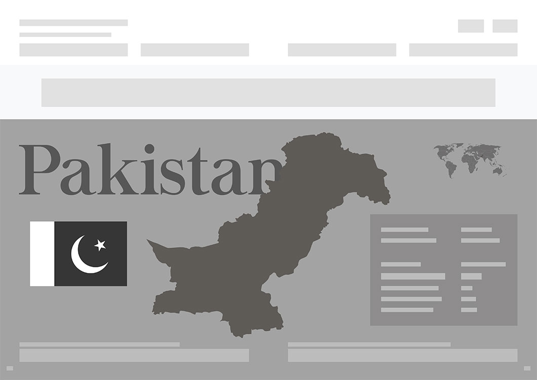
We then integrated these into a greyscale wireframed brochure to ensure we focused on getting the correct balance between the brochure’s content and its typography and whitespace.
The results speak for themselves. We feel that the emphasis we placed on the content and how it worked on the page really paid dividends in the end. The introduction of colour only served to enhance the messages behind each page and helped naturally progress the brochure into its final form.
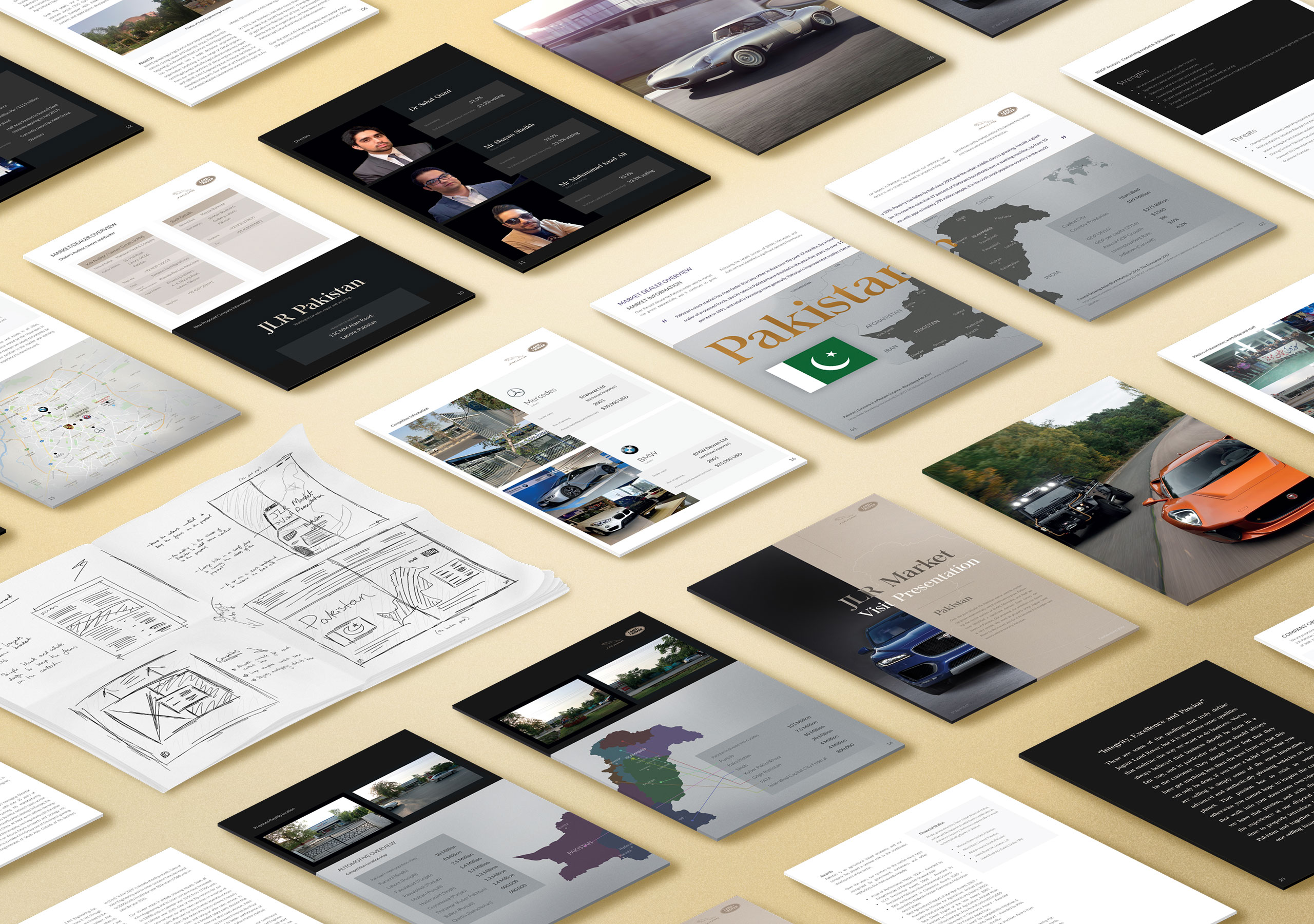
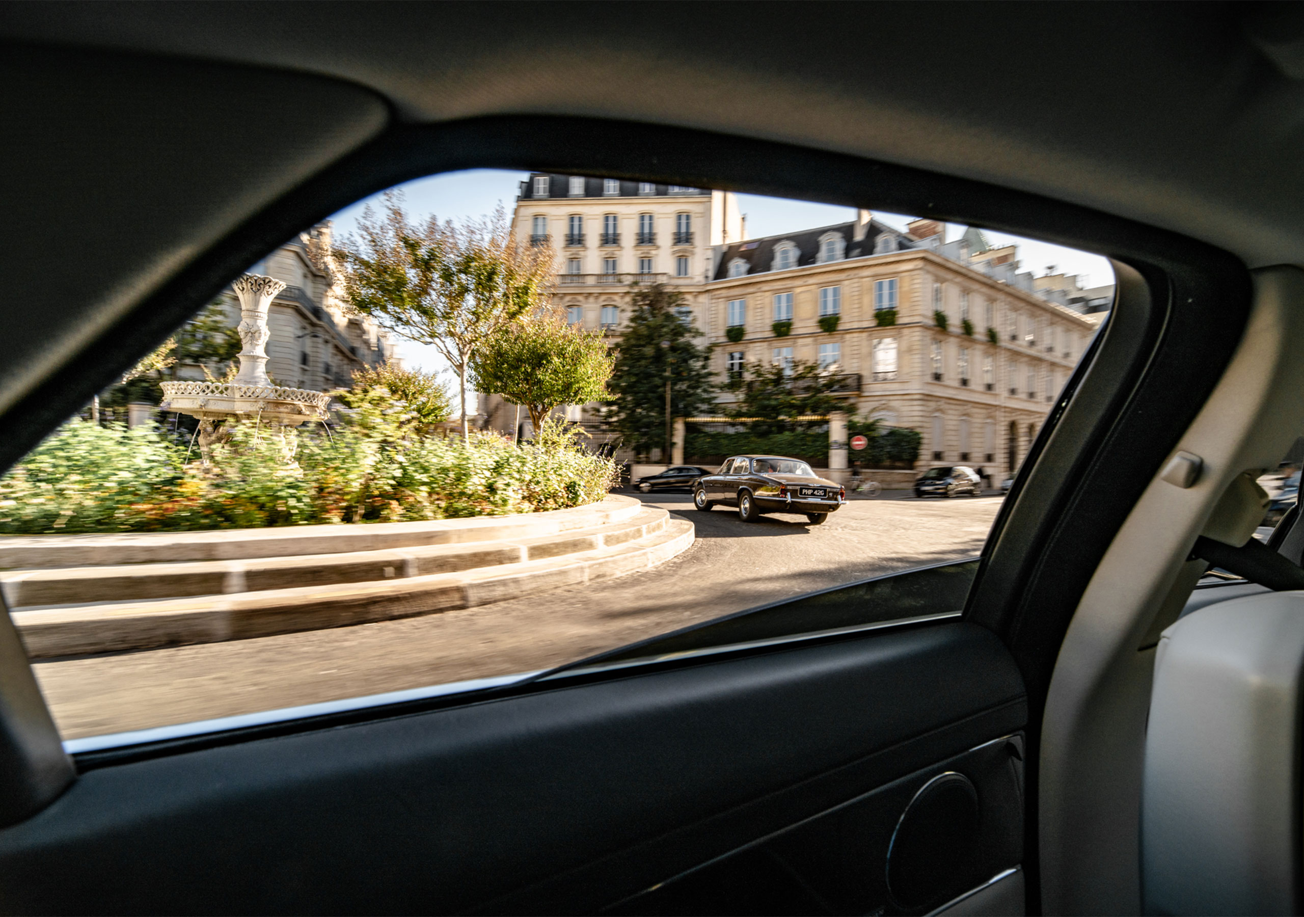
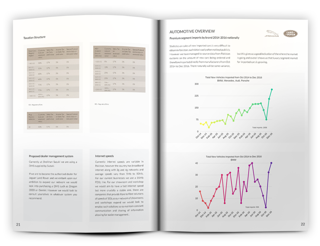
Each spread tells its own story, and the unique components and figures interspaced throughout the brochure help to break up the layouts to make themmore interesting for the reader. We used muted colours where needed to fit the aesthetic of the brochure. It's ok to stare.

We were really happy with how the brochure turned out, and the JLR Pakistan team were delighted with how the final brochure really reinforced the messages they wanted to communicate within their pitch.